
This is my version on Dragoart's charizard. I made all the colours stand out as charizard isn't a dull Pokémon, I wanted all the colours to stand out and be very bright but still not change the way we all know he/she looks. I added shading to his/her body and wings to make him/her look more 3D rather than a flat and plain Pokémon. At first I didn't know what I should do for the background but then I thought 'as Charizard is a fire type Pokémon maybe adding a little bit of fire in the background would be nice' so that's what I did, I made the background black before adding red at the bottom, orange in the middle and yellow on the top before smudging and blending the colours together while also bringing the black in to shape the colours into a fire.

This is the outline I used, once again from Dragoart. I once again removed the white in the picture and removed the Dragoart logo but then it turned into this:
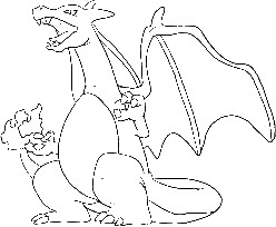
and well just look at the lines, they're pixelated and it doesn't look nice. So because this happened I decided to go around the edges with the brush tool and fill in the gaps (That's why the lines look blurry, so sad).

This is Dragoart's version and I love the background, its an actual landscape unlike mine but what I really hate about this is the fact that the colours are so dull. The orange is super pale, plain and dull, if they had made the colours vibrant and bright like the background then it would of been better but because the only vibrant colours in the image are coming from the background then it kind of takes my eyes of the main thing, Charizard.
No comments:
Post a Comment