Thursday 22 September 2016

Suzuya Juuzou

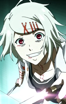
 AHHHHHHH! Sorry, Suzuya is my favourite character. By the way this is just an edit. I removed the background of the original image (the image below) and I made it black as I think it looks the best. I had to re-add the shining part on his weapon as it got removed when I removed the background. I also made his eyes and stiches stand out more by making the colour brighter than in the original. Other than making the eyes brighter I made the pupils to give him a more crazed look which I think matches his personality. I added the flying blood splatters in front of him to symbolise the fact during this scene he was killing ghouls.
I found this image on my anime list (https://myanimelist.net/images/characters/12/276525.jpg) if there are any other Tokyo ghoul characters you want me to edit or maybe to a colouring of then comment.

Friday 16 September 2016

No Face

So this time I finally made something without a outline! Yay! Be happy! Anyway no face is one of my favourite characters from Spirited Away. I used the brush tool and oval tool to create it but when I was finished it seemed boring to me, straight edges and curves so I decided to get the smudge tool and go crazy. It might just be me but I love how it looks, you can still tell its no face but also it isn't like the normal no face (below from the movie) it has my own spin on it and I think its cute. I decided not to give him/her a background because I think no face didn't need one, the white worked better with him/her rather than colour or black (he/she would merge into the background).


Thursday 15 September 2016

Fire Girl

This is my version of the image below. I decided to give her pale skin as I thought it would suit the image better than a darker skin or tanned. I went with a light blonde hair colour with blue tips as I have always loved this combination, electric blue and a light blonde just fit with the image. Sticking to the blue theme I decided to make her eye a blue/green colour but I didn't know where to put the pupil so I placed it where it looked sort of normal but everywhere I tried just looked weird but that might just be me being picky. On the original image she isn't holding anything so I decided to add a blue fireball (sticking to the blue theme) which I think looks really cool and it works well with the way I have designed her. As she has loads of piercings I decided to add an arm tattoo which would wrap all the way around her upper arm. I made the background black as I thought a coloured background would take the focus from the girl, I also went black for her top and her bracelet.
 
This is once again from Dragoart (a lot of the just colouring ones will be because I love their outlines) and all I did to this image war remove the white so when I layer coloured it I would be able to see through the outline and see the colours.

This is the Dragoart coloured version which is very pretty and pink. No I loathe pink, its my enemy, I'll use it but blues, reds, etc will always be better than pink. I love the shading in the hair which if you couldn't tell I suck at, but all in all this image is awesome. The colours work well with the type of image it is, a scene girl, but what I dislike about it is how the image looks like it should have something in her hand (why  I added the fireball) its odd for her hand to be in the picture like that without holding something, her position reminds me of the iPhone emoji:
SEEEEE! Anyway it is a great colouring just the hand annoys me but that's probably just me because I'm mad....

Charizard

This is my version on Dragoart's charizard. I made all the colours stand out as charizard isn't a dull Pokémon, I wanted all the colours to stand out and be very bright but still not change the way we all know he/she looks. I added shading to his/her body and wings to make him/her look more 3D rather than a flat and plain Pokémon. At first I didn't know what I should do for the background but then I thought 'as Charizard is a fire type Pokémon maybe adding a little bit of fire in the background would be nice' so that's what I did, I made the background black before adding red at the bottom, orange in the middle and yellow on the top before smudging and blending the colours together while also bringing the black in to shape the colours into a fire.
This is the outline I used, once again from Dragoart. I once again removed the white in the picture and removed the Dragoart logo but then it turned into this:
and well just look at the lines, they're pixelated and it doesn't look nice. So because this happened I decided to go around the edges with the brush tool and fill in the gaps (That's why the lines look blurry, so sad).
 
This is Dragoart's version and I love the background, its an actual landscape unlike mine but what I really hate about this is the fact that the colours are so dull. The orange is super pale, plain and dull, if they had made the colours vibrant and bright like the background then it would of been better but because the only vibrant colours in the image are coming from the background then it kind of takes my eyes of the main thing, Charizard.


The Angel

This is my colouring of the outline below. I do not own the outline just the colouring. I decided to make her a brunette, its my favourite hair colour right next to black. I added a dark brown to the edges and tips of the hair to give it some detail. I decided to make the eyes a green as I think green eyes look beautiful with brunette hair but that might just be me. My favourite colour is blue so I decided to make the dress a navy blue and adding dark in the creases of the dress, I also went with a blue background which I added lighter shades of blue as I got closer to the middle of the image. Sticking to normal angel wings, well what we imagine angel wings to look like, I went with a bright white adding greys were shadows would be and also partially beneath the other feathers.
This is the outline I used, its from dragoart (obviously) and all I did to this image was remove all the white, the logo and add colour.

This is what dragoart did to the image, there is a lot of detail (a lot more than mine) and that makes this image beautiful although what I dislike about the colouring is the fact that they made it shiny, now I know something's are shiny but this seems to shiny. Her eyes are nice, the shine in them makes the lovely but her wings are shiny, her dress, the background, everything is just shiny and it looks well weird. Other than the shine, everything looks pretty.